
Blog / Best Practices for SEO Data Visualization
Best Practices for SEO Data Visualization
SEO data visualization simplifies complex metrics into clear insights, helping stakeholders make faster decisions. Here's why it matters and how to do it effectively:
- Why visuals work: Humans process visuals 60,000x faster than text. Clear charts save time and improve understanding by up to 80%.
- Common mistakes: Overloading reports, using jargon, and misleading visuals (e.g., improper axes) confuse stakeholders.
- Key principles: Focus on metrics tied to business goals, choose the right charts (e.g., line for trends, bar for comparisons), and avoid unnecessary design elements.
- Effective design: Simplify visuals, use direct labels, and apply colour thoughtfully. Add context with benchmarks and annotations.
- Tailored reporting: Customize dashboards for different audiences (executives, managers, technical teams), update reports regularly, and track their impact.
Pro tip: Use the "What-Why-Action" framework for every chart - show what changed, explain why, and recommend next steps.
SEO reports should drive decisions, not overwhelm. Clear, focused visuals turn data into action.
Monitoring Search Console data in Looker Studio - Google Search Console Training

Set a Clear Purpose Before Creating Visuals
Every visualisation should serve a specific purpose and guide decision-making. Before diving into any charting tool, ask yourself: What decision will this visual support? The answer will determine everything - from the metrics you choose to how you present them.
Purpose-driven visuals transform raw data into actionable insights. Stakeholders need clarity on three key questions: What changed? Why did it happen? What should we do next? This "What-Why-Action" framework ensures that every chart has a clear role beyond just displaying information. Tailoring visuals to your audience can boost understanding by up to 80%. This approach is essential for selecting relevant metrics and designing visuals that resonate with those who need them.
Choose the Right Metrics to Track
Focus on metrics that influence decisions. Separate essential KPIs from raw data that doesn’t drive outcomes. Start by identifying your audience. For example, a CMO might prioritise ROI and market share, while a marketing manager would be more interested in traffic patterns and keyword performance. Ensure your message is clear and digestible within five seconds.
Segment your data based on page type - don’t mix metrics for blogs, categories, and product pages. Each page type serves a different business goal and has unique conversion expectations. For newer websites, prioritise visibility metrics like impressions and rankings in positions 11–20, often referred to as the "strike zone" for quick wins. For more established sites, focus on efficiency metrics such as conversion rates by topic or revenue per session. Always ask yourself, "What action does this metric support?" If there’s no clear answer, you’re likely dealing with a vanity metric that should be excluded.
| Stakeholder Type | Focus | Metrics |
|---|---|---|
| CMO / Executive | ROI, Revenue, Market Share | Conversions, Organic-assisted revenue, Share of Voice |
| Marketing Manager | Channel Growth, Goal Tracking | Traffic trends, Keyword distribution, Top-performing pages |
| Technical SEO | Site Health, Crawlability | Indexation ratio, Core Web Vitals, Server errors |
| Local Manager | Foot Traffic | Map Pack rankings, GMB calls/directions, "Near Me" visibility |
By selecting the right metrics, your visuals will align closely with business objectives, making them more impactful.
Connect SEO Metrics to Business Objectives
Once you’ve chosen the right metrics, tie them directly to your business goals. Translate SEO data into meaningful outcomes, such as lead generation, signups, or revenue.
Different business models require different success measures. For instance, a SaaS startup might track branded search growth and demo signups, while a local UAE business would focus on Map Pack visibility and "near me" searches. Consider this: 76% of consumers conducting local searches on their smartphones visit a related business within 24 hours, and 28% of these searches result in a purchase. For e-commerce, it’s key to segment data by intent - evaluate product pages based on conversion rates and analyse blog content for engagement or assisted conversions.
Stick to the principle of one chart–one message. Each visual should address the "What-Why-Action" framework. For example, if you’re showcasing keyword distribution, connect it to a specific business goal instead of just presenting raw numbers. A clear, insight-driven chart title can turn a simple visualisation into a powerful strategic tool.
Choose the Right Chart for Your Data Question
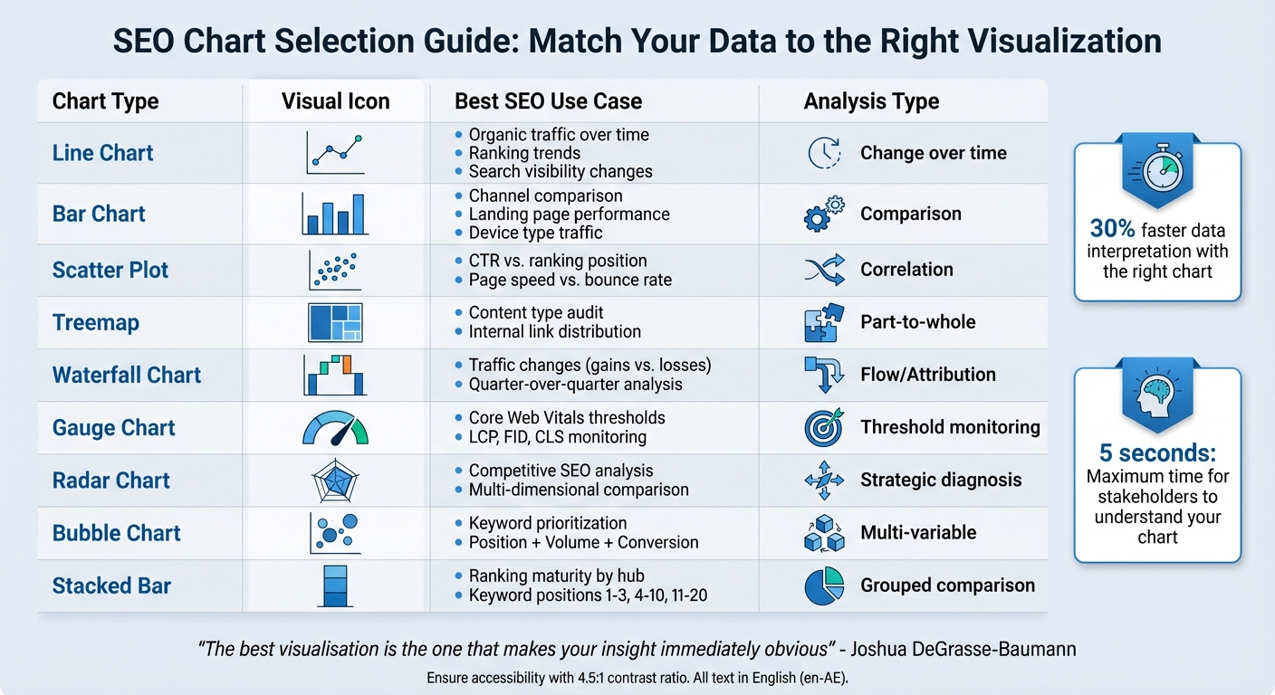
SEO Chart Types and Their Best Use Cases Guide
When working with data, the goal isn't just to display numbers - it's to answer specific questions. Before deciding on a chart type, think about what you want to communicate. Are you tracking changes over time? Comparing different categories? Or uncovering relationships between variables? Picking the right visualisation can save time and make your analysis more impactful - research shows it can cut data interpretation time by 30%. This step is crucial for aligning your insights with the right chart type.
Edward R. Tufte, a prominent figure in data visualisation, summed it up perfectly:
"Graphical excellence is that which gives to the viewer the greatest number of ideas in the shortest time with the least ink in the smallest space".
This philosophy should guide your chart choices. The objective is to ensure clarity, not to overwhelm with unnecessary complexity.
Match Charts to Your Analysis Type
Once you've defined your question, choose a chart that aligns with your analytical needs.
- Line charts: Perfect for tracking trends over time. Use them to monitor organic traffic growth, ranking shifts, or changes in search visibility. They help highlight patterns while filtering out daily fluctuations. For instance, year-over-year comparisons can reveal seasonal trends tied to events like Ramadan or peak tourism in the UAE.
- Bar charts: Ideal for comparing categories, such as traffic by device type, landing page performance, or technical SEO issues. To ensure accuracy, always start the Y-axis at zero to avoid exaggerating differences. Horizontal bars work well for long labels like URLs or page titles, improving readability.
- Scatter plots: Great for showing relationships between two variables, like ranking positions and click-through rates. If you need to add more depth, try bubble charts, where the bubble size represents a third metric, such as conversion potential. This is particularly helpful for "strike zone" analysis - spotting keywords ranked in positions 11–20 with high search volume for quick wins.
- Stacked bar charts: Use these to group keyword rankings into categories like positions 1–3, 4–10, and 11–20. This approach gives a clear snapshot of your keyword portfolio and avoids misleading stakeholders with low-value rankings. Similarly, treemaps are excellent for large-scale portfolio analysis, showing the traffic contribution of hundreds of pages at once.
- Waterfall charts: These are perfect for explaining traffic changes over time. They break down gains (like new content) and losses (such as content decay), making them invaluable for quarter-over-quarter traffic analysis.
- Radar charts: Use these to compare your site’s performance against competitors across multiple dimensions, such as authority, technical health, and content relevance.
| Chart Type | Best SEO Use Case | Analysis Type |
|---|---|---|
| Line | Organic traffic over time; ranking trends | Change over time |
| Bar | Channel comparison; landing page performance | Comparison |
| Scatter | CTR vs. ranking position; page speed vs. bounce rate | Correlation |
| Treemap | Content type audit; internal link distribution | Part-to-a-whole |
| Waterfall | Explaining traffic changes (gains vs. losses) | Flow/Attribution |
| Gauge | Core Web Vitals thresholds (LCP, FID, CLS) | Threshold monitoring |
| Radar | Competitive SEO posture analysis | Strategic diagnosis |
Examples of Effective SEO Charts
Geo charts are a great way to visualise location-based traffic. For businesses targeting local audiences in the UAE, overlaying mobile and desktop performance by emirate can reveal device-specific trends. This is particularly important as mobile traffic makes up 58% of global website visits.
Time series charts are invaluable for understanding seasonal patterns. For example, an e-commerce site could plot organic traffic alongside major shopping events like the Dubai Shopping Festival or back-to-school season. This helps forecast resource needs and prioritise efforts. Tracking ranking distribution over time also shows whether your visibility is improving in high-value positions.
A combo chart, which combines bars and a line, can illustrate the "SEO Subsidy" effect. For instance, it might show organic traffic (bars) increasing while paid cost-per-click (line) decreases. This is a powerful way to demonstrate how SEO captures valuable intent at lower costs - especially useful for budget discussions.
Heat maps are excellent for identifying patterns like click-through rates by SERP position or keyword performance trends by day of the week. For businesses focused on local SEO, heat maps can highlight when "near me" searches peak. This insight is critical, especially since 76% of mobile users conducting local searches visit a business within 24 hours, and 28% of those searches result in a purchase.
As Joshua DeGrasse-Baumann advises:
"The best visualisation is the one that makes your insight immediately obvious. Before you finalise any chart, ask: Can someone understand the key takeaway in 5 seconds?".
Design for Easy Understanding
To ensure your data visualisation is effective, it must be easy to understand at a glance. Studies show that the brain processes images in just 13 milliseconds, and people retain 80% of visual information compared to only 20% of written details. If your audience can’t grasp the main point of your visualisation within five seconds, it’s too complicated. The aim is to highlight the most important data clearly and quickly.
Remove Unnecessary Elements
Chart junk refers to anything in your visualisation that doesn’t add value or meaning. This includes 3D effects, shadows, excessive grid lines, and distracting animations. These elements clutter your charts and dilute the impact of your data. Keep it simple.
Legends often make viewers shift their focus between the chart and a separate key. Instead, use direct labelling - place text right next to data points, lines, or bars. For example, if you’re showing organic traffic by device type, label each bar directly to save time and improve clarity.
Stick to one main theme per chart. If you’re illustrating keyword rankings, don’t cram in backlink growth or Core Web Vitals data into the same visual. Break complex stories into smaller, focused charts. Avoid "spaghetti charts" with too many overlapping lines - limit yourself to three or four lines at most. For pie charts, keep the number of slices under six, and group smaller values into an "Other" category.
Once you’ve simplified your visuals, turn your attention to proper labelling and colour use.
Apply Colours and Labels Properly
Colour should emphasise important data, not confuse the viewer. Use muted greys for background information and bold colours for key metrics. For instance, if you’re highlighting a 22% increase in organic traffic, let that stand out in your brand colour while keeping other data in neutral tones.
Don’t rely solely on colour to convey meaning. Around 4.5% of people have colour-vision deficiencies. Avoid red–green combinations for "good" versus "bad" performance, as these can be hard to distinguish. Instead, use blue–orange scales or different shades of one colour. Add patterns, dashed lines, or shapes (like circles, squares, or triangles) to further differentiate data sets.
Use clear and bold titles (15pt bold) and readable axis labels (12pt) to create a visual hierarchy. Titles should summarise the key takeaway - write something like "Organic Traffic Increased 22%" instead of a generic "Organic Traffic Q2". For large numbers, use commas (e.g., 1,000,000) and abbreviations like "k" for thousands to keep things tidy. Round numbers unless precision is absolutely necessary.
Follow Accessibility Standards
Accessible design ensures everyone can interpret your data, regardless of their abilities. Maintain a contrast ratio of at least 4.5:1 for text against the background and 3:1 for graphical elements like bars or pie slices. This helps users with low vision and makes visuals easier to read in bright environments, such as during presentations.
For complex charts, include a screen-reader-friendly data table or a link to the raw data. Use ARIA attributes (e.g., aria-describedby) to connect charts with text summaries for users relying on assistive technologies. Ensure that text within visuals can be resized up to 200% without losing clarity or functionality.
Edward R. Tufte once said:
"Because they do have a natural visual hierarchy, varying shades of gray show varying quantities better than colour... the shades of gray provide an easily comprehended order to the data measures".
This wisdom underscores a key point: simplicity and contrast are what truly make data understandable.
sbb-itb-058f46d
Add Context and Annotations
A chart without context is just numbers on a page. For stakeholders to act on data, they need to understand its meaning and relevance. Context turns raw figures into a story that informs decisions. This means incorporating clear titles, relevant benchmarks, and transparent data sources into your visualisations.
Write Clear Titles and Subtitles
A good title doesn’t just describe the chart - it highlights the key takeaway. For example, instead of "Organic Traffic Q4", write "Organic Traffic Increased by 22% in Q4." This approach shifts the focus to the insight, making your report more strategic and actionable. Informative titles convey the main message, while descriptive ones only note variables or timeframes.
Make titles self-explanatory so they can stand alone. Avoid technical jargon, and if you must use acronyms like "CWV" or "SERP", define them directly within the chart. The aim is clarity and immediate understanding, not showcasing technical expertise.
Add Reference Lines or Benchmarks
Numbers by themselves don’t tell the whole story - they need benchmarks to provide context. As Joshua DeGrasse-Baumann puts it, "A number without a comparison is meaningless. Always include Year-over-Year (YoY) or forecast benchmarks".
For instance, ecommerce businesses face predictable patterns like Black Friday surges or post-holiday slowdowns. Including YoY comparisons reveals genuine growth, unaffected by these calendar-driven fluctuations. Reference lines can also help, such as Google's benchmark for a "Good" Largest Contentful Paint score (0–2.5 seconds), with scores above 4 seconds marked as "Poor". Colour-coded zones (green, yellow, red) make it easy for stakeholders to gauge whether immediate action is needed.
Significant events should be annotated directly on the chart. Mark things like algorithm updates, site migrations, or PR campaigns with vertical lines or notes to explain unexpected spikes or drops. This not only prevents confusion but also demonstrates that you understand the full context behind the data.
Show Data Sources Clearly
Helen Pollitt, Director of SEO at Getty Images, emphasises:
"Our reports ride on a lot of trust that the data we're using is… actually right".
If stakeholders can’t see where your numbers come from, they may question their credibility. Always label charts with their data source, such as "Google Search Console" or "GA4". Transparency ensures your audience knows you're not cherry-picking data to only show successes.
Different tools collect data in unique ways. For example, Google Analytics measures sessions differently than server logs. Identifying the source helps stakeholders understand these nuances. If your data collection methods change - like when internal traffic filtering is applied - annotate the shift on your chart. This reinforces trust by maintaining a consistent and reliable source of truth.
Use Interactive and Layered Visualizations
Static charts can only take you so far. Interactive dashboards, on the other hand, allow stakeholders to explore data on their own terms. This means they can uncover insights without constantly requesting new reports. This self-service approach not only saves time - cutting analysis time by as much as 30% - but also enables better decision-making. With over 70% of professionals checking business data on mobile devices multiple times a day, it’s crucial that your visualizations function flawlessly across different screen sizes. This builds on the earlier point about tailoring visuals to meet the needs of your audience.
Add Filters and Drill-Down Features
Sophie Brannon, an SEO Specialist, offers a practical tip:
"Create tabs within the dashboard to divide information, enabling stakeholders to get a clear view of how various efforts are going without getting bogged down with information overload".
For instance, you can organise your dashboard using separate tabs like /blog/, /products/, or /category/ to ensure data with different conversion goals doesn’t get mixed up.
Drill-down features take this further by letting users move from a broad overview to detailed specifics. For example, a stakeholder might start with site-wide organic traffic data, then drill down to see which subdirectories are driving that traffic, and finally zoom in on specific pages or keywords. Including filters for "Strike Zone" keywords - those ranking between positions 4 and 10 - can offer content teams a ready-made action list. To make filters more user-friendly, group related ones together and use borders as visual cues. As Tableau puts it:
"Interactivity can make the difference between a confusing visualization and an all-star analysis".
These interactive features, paired with smart filtering, can significantly enhance how stakeholders interpret and act on data.
Combine Related Metrics
Once interactivity is in place, layering related metrics can elevate your visual storytelling. By combining metrics, you can reveal connections that might otherwise go unnoticed. For example, a combo chart that uses bars to show organic traffic volume and a line to track blended cost-per-click can clearly illustrate how increased organic traffic reduces overall acquisition costs. Similarly, bubble charts are a great way to display three dimensions at once - position on the X-axis, search volume on the Y-axis, and bubble size representing conversion potential.
For portfolio audits, treemaps work wonders by visualising hundreds of categories at a glance. The size of each section reflects volume, while colour highlights year-on-year growth or decline, making it easy to spot high-volume areas that are struggling. Stacked bar charts can show ranking depth within each category, breaking down how many keywords sit in positions 1–3 versus 4–10. A crucial rule to follow: stick to "one chart, one message." If you need to show both a trend and a breakdown, use separate visuals instead of cramming everything into a confusing "Franken-chart".
| Chart Type | Primary Metric | Secondary Metric | SEO Use Case |
|---|---|---|---|
| Treemap | Volume | Growth/Decay | Content Portfolio Audit |
| Bubble Chart | Position | Value | Keyword Prioritisation |
| Combo Chart | Quantity | Efficiency | SEO vs. Paid Search ROI |
| Stacked Bar | Volume | Ranking Depth | Ranking Maturity by Hub |
Apply Best Practices for Stakeholder Presentations
Effective visualisations should do more than just display data - they need to drive decisions and influence how resources are allocated. As Risto Rehemägi, Co-Founder of ContentGecko, aptly explains:
"If your dashboard doesn't force a stakeholder to make a decision or change a budget, it isn't a report – it's just noise".
In fact, 77% of organisations report improved decision-making when data is presented through clear, impactful visuals.
Customise Visualisations for Different Audiences
Every stakeholder group has unique needs, so your visualisations should reflect that. This ties back to the principle of aligning SEO metrics with overarching business goals. For example:
- Executives: They need high-level metrics - think revenue, ROI, and market share. Use visuals like gauge or radar charts to illustrate competitive positioning at a glance.
- Marketing Managers: These stakeholders benefit from insights into channel performance, such as attribution data and impression share. Bar or waterfall charts work well here.
- Technical SEO Teams: They require detailed reports, focusing on crawl errors or Core Web Vitals. Doughnut charts and heat maps can effectively present this granular data.
The key is tailoring reports to answer the most pressing questions for each audience. Avoid mixing unrelated data types - like blog metrics alongside product performance - since each serves a different business goal. For executives, it’s especially important to include a concise summary of the core takeaways on the first page to ensure the message is clear and immediate.
Review and Update Regularly
Customised visuals are only as good as their relevance. To keep them useful, establish a reporting rhythm:
- Weekly Dashboards: Focus on tactical metrics like organic sessions and conversions.
- Monthly Reviews: Dive deeper into content performance, such as click-through rates (CTR) and average position.
- Quarterly Presentations: Highlight strategic metrics like Customer Lifetime Value to assess ROI.
Year-over-year comparisons are essential for filtering out seasonal fluctuations, such as during Ramadan sales or the Dubai Shopping Festival. Additionally, set up automated alerts to flag significant traffic drops (e.g., over 20%), allowing you to address issues promptly between scheduled updates.
Regularly walk stakeholders through the dashboards to clarify any points of confusion and gather feedback. Treat these reports as dynamic tools that evolve with your audience’s needs, and always verify your data to maintain credibility.
Track Visualisation Impact
The true measure of a visualisation’s success lies in its ability to inspire action. Are your charts leading to budget reallocations, content updates, or technical fixes? For instance, regularly showcasing keywords ranked in positions 4–10 can serve as a clear "to-do" list for content teams.
Use the "What, Why, What Next" approach with every chart:
- What: Present the data.
- Why: Add annotations to explain the trends.
- What Next: Provide actionable recommendations.
This structure not only promotes accountability but ensures stakeholders clearly understand the steps they need to take. By consistently tracking the impact of your visuals, you can demonstrate their value and refine them for even greater effectiveness.
Conclusion
SEO data visualisation isn't just about making numbers look good - it's about turning them into decisions that matter. By applying the PICA Protocol - Purpose, Insight, Context, and Aesthetics - you can transform raw data into insights that drive action. The numbers back this up: 77% of organisations report better decision-making when data is presented visually, and people retain 80% of visual information compared to only 20% of written content. The key is to strip away the unnecessary and focus on what truly matters.
Cutting out visual clutter is crucial. As Edward Tufte highlights, the best visuals deliver the most insight with the least distraction. This involves removing extra grid lines, using colour intentionally to emphasise key points, and ensuring every chart answers a specific business question. Once the noise is gone and clarity is achieved, the next step is to turn those insights into actionable strategies.
It's also vital to customise your visualisations to suit your audience. Every chart should address their unique decision-making needs. Whether you're reviewing dashboards weekly for tactical updates or quarterly for strategic insights, keeping your reports relevant ensures they remain actionable. By using the What, Why, Recommendations framework discussed earlier, your charts do more than inform - they drive accountability and align priorities. When crafted thoughtfully, your visualisations become tools that simplify complexity and bring teams together with a shared understanding of SEO performance.
FAQs
What is the best way to choose the right chart for visualising SEO data?
Choosing the right chart for your SEO data can make all the difference in how effectively your insights are communicated. The key is to match your data type with the story you want to convey. Here are a few examples:
- Bar or column charts are perfect when you need to compare metrics, such as keyword performance or the traffic different pages are generating.
- Line charts are your go-to for illustrating trends over time, like tracking the growth of organic traffic month by month.
- Pie charts shine when showing proportions, such as the breakdown of traffic sources or device usage.
Keep your visuals clean and straightforward, making it easy for stakeholders to quickly grasp the main points. Avoid unnecessary clutter and focus on selecting charts that align with your objectives and resonate with your audience.
What mistakes should I avoid when creating SEO data visualisations?
When designing SEO data visualisations, it’s essential to strike a balance - too much information crammed into a visual can overwhelm your audience, making it hard for them to grasp the key takeaways. Similarly, choosing the wrong chart type or using distorted scales can misrepresent the data and lead to misguided decisions.
On the flip side, oversimplifying complex data can strip away crucial details, masking trends or relationships that might be pivotal. Equally important is understanding your audience. For instance, executives often prefer concise, high-level summaries, while marketers might require more granular metrics to inform their strategies.
To make your visuals impactful, prioritise clarity, select the most appropriate visualisation formats, and emphasise actionable insights. This way, your audience can connect with the message and make informed decisions.
How can I effectively connect SEO metrics to business goals?
To bridge the gap between SEO metrics and business objectives, it's crucial to focus on key performance indicators (KPIs) that highlight both SEO achievements and their impact on the broader business. Metrics like organic traffic growth, conversion rates, and revenue from SEO efforts can provide a clear connection to goals such as boosting sales or improving brand visibility.
Sharing these insights in visually appealing formats, such as charts or dashboards, can make it easier for stakeholders to grasp the value of SEO initiatives. A tiered reporting system can help streamline this process. For instance, you might provide weekly updates on technical progress, monthly reviews of strategic outcomes, and quarterly comparisons of overall performance. This structured approach ensures consistent tracking, timely refinements, and alignment with shifting business priorities, positioning SEO as a vital component of your organisation's success.