
Blog / Data Visualization in Customer Journey Analytics
Data Visualization in Customer Journey Analytics
Understanding customer behaviour is essential for businesses in the UAE, especially in industries like retail, real estate, and technology. Data visualisation simplifies large datasets, making it easier to analyse customer interactions across websites, apps, call centres, and stores. This helps businesses identify issues like cart abandonment or payment drop-offs and improve customer experiences.
Here’s what you need to know:
- Key Techniques: Sankey diagrams track customer paths, funnel charts analyse drop-offs in structured processes, and heatmaps highlight user engagement areas.
- Benefits: These tools reduce data complexity, enabling faster insights and better decision-making without relying heavily on IT teams.
- Steps to Implement: Collect and unify data, map customer journeys, and create interactive dashboards for real-time insights.
With the right tools, businesses can visualise customer journeys, resolve friction points, and boost loyalty.
Customer Journey Analytics Explained: Complete Visual Guide to Understanding Your Customers
Data Visualization Techniques for Customer Journeys
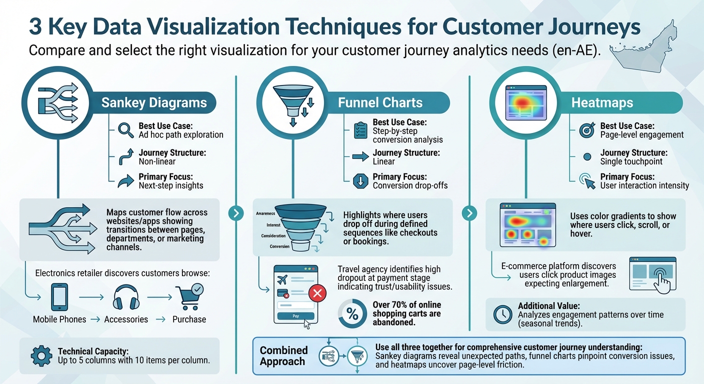
Comparison of Data Visualization Techniques for Customer Journey Analytics
The right visualization can turn complex data into actionable insights, helping businesses in the UAE understand customer successes and challenges. Three key methods - Sankey diagrams, funnel charts, and heatmaps - each play a unique role in mapping customer journeys. Let’s explore how these techniques reveal different aspects of customer behaviour.
Sankey Diagrams for Customer Flow Mapping
Sankey diagrams, or flow visualizations, are perfect for exploring customer paths when there’s no predefined route. They visually map how users move through websites or apps, showing transitions between pages, departments, or marketing channels.
For instance, a Dubai-based electronics retailer might discover through a Sankey diagram that customers browsing the "Mobile Phones" section often move to "Accessories" before completing their purchase. This insight opens up opportunities for cross-selling. These diagrams also allow businesses to track customer journeys across dimensions, such as following users from a social media campaign to a product category and then to the payment page.
To make the most of Sankey diagrams, define key anchors - like a starting point or a conversion goal. Advanced tools can handle up to five columns with 10 items per column, keeping the visualization clear and focused.
Funnel Charts for Conversion Analysis
Funnel charts, also known as fallout visualizations, are ideal for analysing linear processes where users follow a defined sequence. They highlight where users drop off during a process, such as retail checkouts or travel bookings.
Take, for example, a travel agency in Abu Dhabi. By using a funnel chart, they could examine their booking flow, from flight selection to payment. If the chart reveals a high dropout rate at the payment stage, it might point to trust or usability issues. Funnel charts are also useful for side-by-side comparisons, such as evaluating whether new visitors or returning customers face more friction.
Unlike Sankey diagrams, funnel charts require you to define the sequence beforehand, making them best suited for measuring performance against a known path.
Heatmaps for User Behaviour Analysis
Heatmaps use colour gradients to show where users click, scroll, or hover, making them excellent for identifying areas of high engagement or friction. For example, an e-commerce platform catering to the UAE market might discover through heatmaps that users frequently click on product images expecting them to enlarge, revealing a usability issue.
They’re also useful for analysing engagement patterns over time, such as shifts in activity during Ramadan or weekend shopping peaks. This time-based insight can help businesses optimise their strategies to align with customer behaviour.
| Visualization Type | Best Use Case | Journey Structure | Primary Focus |
|---|---|---|---|
| Sankey Diagram | Ad hoc path exploration | Non-linear | Next-step insights |
| Funnel Chart | Step-by-step conversion | Linear | Conversion drop-offs |
| Heatmap | Page-level engagement | Single touchpoint | User interaction intensity |
When used together, these techniques provide a well-rounded understanding of customer journeys. Sankey diagrams highlight unexpected paths, funnel charts pinpoint conversion issues, and heatmaps uncover friction at the page level. Each method addresses a unique layer of how customers interact with your digital platforms.
How to Implement Data Visualization in Customer Journey Analytics
To make sense of scattered data in customer journey analytics, data visualization plays a crucial role. It transforms disconnected information into clear, actionable insights. This process involves three main steps: consolidating data sources, mapping customer journeys, and creating interactive dashboards. Each step builds on the previous one, offering a structured approach to understanding how customers interact with your business across various touchpoints.
Step 1: Collect and Combine Customer Data
Effective data visualization starts with gathering and unifying your data. This means pulling information from CRM systems, POS terminals, websites, mobile apps, and call centres into a single platform. To achieve this, businesses use a unique customer identifier. Techniques like field- or graph-based identity stitching ensure that interactions across multiple devices and channels link back to one customer profile. Consistency is key - data standardization ensures everything aligns. For instance, the Experience Data Model (XDM) provides a consistent structure for organising diverse data types.
Imagine a retailer in Dubai trying to merge online transaction data with in-store purchases. Both datasets must use the same date format (DD/MM/YYYY), currency (AED), and field naming conventions. Beyond numbers, qualitative insights from customer interviews and surveys add depth. For example, if a customer abandons a cart worth AED 500, it could highlight concerns about payment security or unexpected shipping fees.
Step 2: Build Journey Maps
Once data is unified, the next step is to create journey maps that visualise how customers move from awareness to conversion - or even retention. Start by connecting datasets and defining clear reporting rules. This not only highlights successful paths but also reveals where customers drop off. Given that over 70% of online shopping carts are abandoned, identifying these exit points can help recover lost revenue.
Choose the right visualisation tools based on the journey's structure. Flow diagrams are great for exploring non-linear paths, while fallout charts are better suited for structured sequences like checkout processes. For more complex journeys, tools like Journey Canvas allow you to map multi-path experiences through intuitive drag-and-drop features.
It’s also helpful to describe each stage of the journey in terms that resonate with the customer. For instance, instead of "Support Ticket Created", use language like "I need help" to reflect the customer’s perspective. Collaboration across teams ensures that no touchpoints are missed, breaking down silos that might otherwise leave blind spots. Once journey maps are in place, they can feed into interactive dashboards for actionable insights.
Step 3: Create Interactive Dashboards
Interactive dashboards are where insights come to life, enabling real-time decision-making. Platforms like Analysis Workspace provide drag-and-drop interfaces, making it easy for users to filter data, drill into specific areas, and spot trends - without needing advanced technical skills. Features like hover-over details and clickable nodes empower teams to explore data independently, while mobile-optimised scorecards give executives access to key metrics anytime, anywhere.
These dashboards allow for multi-dimensional analysis, combining data points like pages, devices, departments, and marketing channels into a single view. For example, a travel agency in Abu Dhabi could track users from Instagram ads to the flight booking page and then to payment completion. This reveals which campaigns lead to actual bookings, not just clicks.
When designing dashboards, simplicity matters. Avoid clutter by removing unnecessary gridlines and labels. Stick to a carefully chosen colour palette that differentiates categories and ensures accessibility for users with colour vision deficiencies. Organisations that implement advanced customer journey analytics often report benefits like a 90% reduction in data latency and campaigns that are 62% more personalised.
"Upgrading to Customer Journey Analytics brought us advantages regarding flexibility and analytical capabilities." – Andreas Stuht, Head of ecommerce Analytics, OTTO
sbb-itb-058f46d
Case Studies in Customer Journey Analytics
These examples showcase how visualisation tools enhance customer journey analytics across industries like retail, media, and travel.
Retail: Tailoring Shopping Experiences
Retailers use visualisation to transform complex data into easy-to-read maps, charts, and graphs, helping them quickly identify drop-off points or emerging trends. With real-time tracking, they can monitor key performance indicators (KPIs) and adjust inventory or marketing campaigns on the spot. This reduces waste and ensures offers reach the right audience. Predictive analytics, when visualised effectively, enable retailers to engage customers with personalised messages. For instance, a fashion retailer in Dubai could use heatmaps to detect when mobile shoppers abandon their carts due to unexpected shipping costs at checkout. By visualising these patterns, the retailer can test strategies like free shipping thresholds or clearer pricing to recover lost sales. Similarly, media companies apply these tools to enhance subscriber retention.
Media: Boosting Subscriber Retention
Media companies rely on data visualisation to tackle subscription retention challenges. Cohort analysis groups users by sign-up dates or subscription tiers, tracking retention trends and identifying segments at risk of churning. Fallout visualisations highlight specific drop-off points during processes like sign-up or renewal, while flow diagrams help trace the paths leading to disengagement. Tools like Journey Canvas map out the often non-linear paths users take, uncovering retention issues across various entry points and platforms. Travel companies also benefit from these insights to address booking-related challenges.
Travel: Fixing Booking Funnel Issues
Travel companies use data visualisation to pinpoint and resolve problems in the booking process. Fallout reports identify the exact stages where users drop off - whether during search, selection, payment, or confirmation. Flow analysis uncovers navigation issues that may lead to booking abandonment. Journey Canvas tools provide a detailed view of complex user journeys, especially for mobile bookings where customers often switch between apps and browsers. These insights are crucial for understanding and improving multi-device and multi-channel booking experiences.
How Wick Supports Customer Journey Analytics
Wick takes a comprehensive approach to customer journey analytics, ensuring that every insight is actionable and directly linked to better outcomes.
Unified Digital Ecosystems with Wick
Wick's Capture & Store pillar gathers customer data from all touchpoints - both online and offline - and combines it into a unified profile. This eliminates silos between departments by connecting customer identities and interactions across multiple channels. Through advanced identity stitching, Wick links various identifiers, offering a seamless view of each customer’s journey across platforms. The result? A centralised data warehouse that manages the entire lifecycle of data, from its initial collection to archiving, while allowing scalable integration across departments.
For UAE businesses, especially retailers handling high traffic during seasonal sales or tourism surges, this unified data approach enables quick adjustments to marketing strategies, inventory management, and pricing decisions. This strong data foundation also supports advanced analytics, laying the groundwork for AI-powered personalisation.
AI-Driven Personalisation
With this integrated digital ecosystem in place, Wick employs AI to elevate customer experiences. Its AI-powered analytics process works in real time, analysing both structured and unstructured data to uncover patterns and predict customer behaviour. By using machine learning and natural language processing, Wick refines insights through the analysis of customer feedback and sentiment. This leads to hyper-personalised experiences, where individual preferences are anticipated, and the next steps in the customer journey are optimally recommended.
According to Adobe's 2025 report, businesses leveraging AI for customer experience can achieve up to a 25% revenue boost. Moreover, 71% of companies plan to invest in AI-powered customer journey analytics by 2027, with the market projected to grow at a compound annual growth rate (CAGR) of 20.8% from 2023 to 2028.
Conclusion
Data visualisation has reshaped how businesses approach customer journey optimisation. Instead of sifting through endless spreadsheets, organisations can now clearly see where customers thrive, face challenges, or drop off before completing a conversion. Tools like flow visualisations, fallout visualisations, and Journey Canvas act as essential guides, mapping out the customer’s path from initial awareness to purchase and even beyond.
The impact of advanced customer journey analytics is undeniable. Businesses have reported a 90% reduction in data latency and a 62% boost in personalised campaign results - numbers that highlight the clear advantages of turning data into actionable insights. These tools don't just make data easier to understand; they actively drive better results across customer interactions.
For UAE businesses, especially during high-traffic periods like seasonal sales or tourism booms, a unified data strategy can make all the difference. By identifying friction points in real time, organisations can refine every customer touchpoint, whether it’s a website, a call centre, or an in-store experience. Data visualisation bridges the gap between complexity and clarity, ensuring decision-makers at all levels - not just data specialists - can act effectively.
Turning scattered data into meaningful insights requires a strong foundation. Wick’s unified digital ecosystem is a prime example of how integrated data and AI-driven analytics can transform fragmented information into growth opportunities. By consolidating data from various channels into a single, cohesive view and leveraging AI to identify patterns and predict behaviour, businesses can ensure every visualisation tells a comprehensive story.
As the case studies have shown, clear and insightful visualisations empower businesses to turn customer interactions into strategic wins. Whether it’s resolving issues in booking flows, enhancing subscriber retention, or tailoring shopping experiences, combining detailed data collection with intelligent visualisation and strategic planning lays out a clear path for success. Implementing these approaches promptly will help secure a competitive edge in today’s fast-paced market.
FAQs
How does data visualization enhance customer journey analytics for businesses in the UAE?
Data visualization plays a key role in helping UAE businesses gain deeper insights into customer journey analytics. By transforming complex datasets into clear, actionable visuals, tools like flowcharts, heat maps, and journey diagrams make it easier to track customer interactions across multiple channels. These visuals uncover essential patterns such as entry points, progression paths, and drop-off stages. This level of clarity allows businesses to pinpoint areas that need improvement, refine customer touchpoints, and design more personalised experiences for the UAE’s diverse and tech-savvy population.
With features like real-time monitoring and customer segmentation, businesses can respond swiftly to shifting behaviours. For example, visualising points where customers abandon their journey can prompt immediate adjustments to reduce friction and boost engagement. In a market like the UAE, where innovation and digital-first strategies are central to growth, using these tools empowers businesses to make data-driven decisions that enhance customer satisfaction and increase conversion rates.
What are the main differences between Sankey diagrams, funnel charts, and heatmaps in customer journey analytics?
When it comes to visualising customer journey data, Sankey diagrams, funnel charts, and heatmaps each bring something unique to the table.
Sankey diagrams are all about flow. They visually represent how users navigate through different stages of a process, highlighting proportions and transitions. They’re especially handy for spotting major drop-offs or bottlenecks in user pathways, making it clear where improvements might be needed.
Funnel charts, on the other hand, zero in on conversion rates. They show how many users move through each step of a journey and where they drop off. For example, they can reveal how many visitors progress from browsing products to actually completing a purchase, helping identify where customer engagement dips.
Heatmaps focus on user interaction. By using colour intensity, they show which areas of a webpage get the most clicks or engagement. This makes them perfect for understanding what grabs attention and what gets overlooked on a page.
In short, each tool offers a different perspective: Sankey diagrams map the flow, funnel charts track conversions, and heatmaps highlight user interaction hotspots. Together, they provide a well-rounded view of the customer journey.
How do interactive dashboards improve decision-making in customer journey analytics?
Interactive dashboards play a key role in improving decision-making within customer journey analytics by offering dynamic, real-time visualisations of customer behaviour across various touchpoints. These dashboards make it simple to detect trends, pinpoint areas of friction, and identify opportunities to boost engagement - all as they happen. For instance, flow diagrams can clearly show where users drop off or continue their journey, allowing teams to act swiftly to enhance the overall customer experience.
With access to up-to-the-minute insights, businesses can fine-tune their strategies, improve customer interactions, and address challenges before they escalate. This approach ensures decisions are informed by the most current data, paving the way for a more tailored and impactful customer journey.